Back to Case Studies
Anderson Crain Investment Group Logo Design
The Anderson-Crain Investment Group was looking for a logo that they could establish a brand around, and decided to work with us at Skosh. After moving through the creative process, we were quite happy with the outcome.
Anderson-Crain Investment Group is a private equity real estate company that is active in the Midwest, Southwest, and Northeast markets. At Skosh, we had the pleasure of working with them to put together a logo and color scheme on which the could build their brand. The final result is a clean, competent, and professional look that helps them stand out in their field at a critical stage in their growth.
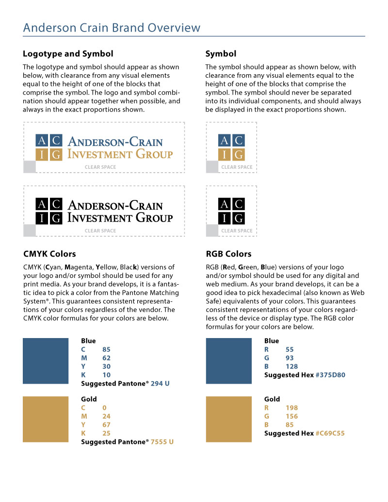
Anderson-Crain is an organization that emulates integrity and professionalism, and their logo needed to do the same. The version of the logo that ended up winning out is a sturdy design of four blocks, with one letter in each block. The words are set in a serif font, in small caps.


Brand Overview
In addition to designing the logo and creating a full logo set, we felt it important to provide a brand overview, detailing the color formulas and general guidelines regarding the utilization of the logo.

