Back to Case Studies
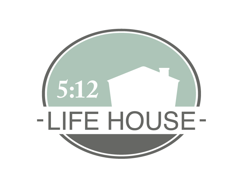
5:12 Life House Logo
Doing work that matters is a priority for me, so when an opportunity arose for me to design a logo for a local ministry called 5:12 Life House, I was thrilled to be able to help. Their unique vision was a joy and challenge to convey, and I hope I did it justice.
One of the things I love about having a side business is being able to take on some design work that I otherwise wouldn’t get the chance to do. There’s nothing quite like firing up Illustrator, InDesign, or Photoshop, and urging my hands to remember what to do. They eventually cooperate, and off we go ![]()
Coming Home
5:12 Life House has a profound vision:
…to provide a stable, secure and generous expression of blessing to families serving in full time ministry by providing a comfortable, affordable and inviting home during their furlough and/or temporary ministry assignment in Grand Forks, ND.
The founders recognize that one of the most significant needs for missionary families serving overseas and returning home to Grand Forks is to find adequate and stable housing. There is a massive amount of change these families are dealing with —travel, new experiences, new friendships, new schools, and an entirely different culture. The goal of the Life House is to meet this need with the least amount of friction possible. The house is furnished and stocked with the goal of being move-in-ready. There is food in the cupboards and in the fridge, the beds are made, and the utilities are running. It is supposed to feel like a home for families who are wading through a significant transition.
A Family Decision
I launched into the design process with the lofty goal of capturing and conveying this touching vision, and came back with a half-dozen directions for the logo. By this time the renovation was completed on the house, and it was nearly ready to serve its first family. In order to decide on a concept I provided, the founders decided to seek input from their children’s families, who are themselves international missionaries. After a family vote, they returned to me with the concept that resonated most.
Next I put together a color study to help nail down the final colors that would be used in the final logo. They settled on a color scheme that complements the logo in a great way. They decided on a green that communicates life and growth, and a warm gray that feels grounded and secure.

Final Thoughts
It is inspiring to be part of 5:12 Life House’s story, and I am thrilled to have given them a visual symbol they feel represents their vision. As families move in and out of the house, I imagine those four walls will mean many things to many different people. And the fact that I am able to be part of it is humbling.
Whoever has the Son has life; whoever does not have the Son of God does not have life.
1 John 5:12 (the inspiration for the 5:12 Life House)
Previous Case Study Next Case StudyI loved having the opportunity to make a logo for 5:12 Life House. I wrote about it here: https://t.co/n8lk1ebvUb
— Rand Seay (@randseay) February 3, 2017
