Back to Case Studies
Northland Christian Counseling Center Site
Northland Christian Counseling Center is a wonderful place through which countless people have journeyed, and through which countless more will. Their website needed a fresh start, and I loved being able to provide that.
You don’t have to spend much time at Northland to get a taste of the love they have for the people who come through their doors. Communicating that sentiment when someone walks through their “virtual door” is critical to them. After Skosh won the bid to provide web and design services, I took up the challenge to communicate their message. The design ended up being clean, approachable, and simple. Plenty of white space gives the content room to breathe, and allows the message to come through clearly and unhindered —that you are valuable.
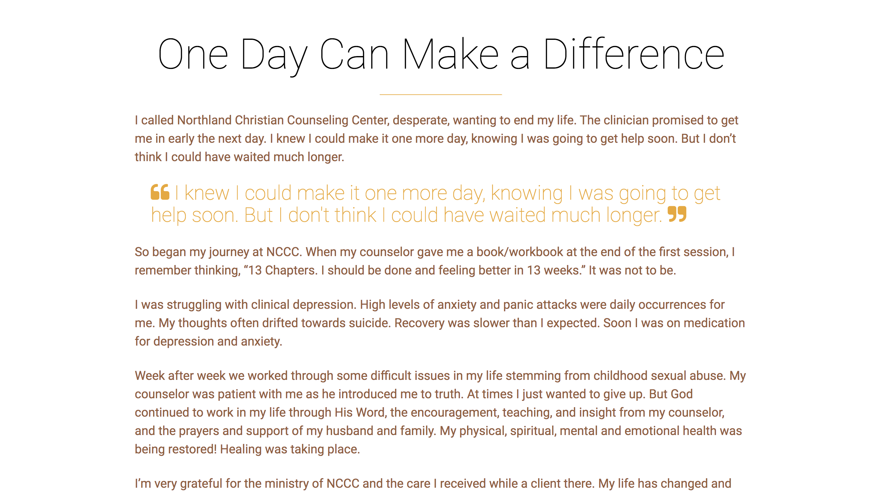
Northland’s approach is powerful and speaks for itself. There was no need for flashy design elements to dress up drab content; it just to be held up clearly and elagantly. I spend a goodly amount of time getting the typography just right, so that testimonial stood on its own, the services could be communicated quickly and effectively, and so that the counselors biographies were able to shine. This site really needed to be a welcoming face with an encouraging smile. The first impression can be critical in determining whether or not someone seeks help.
A Ministry of Restoration
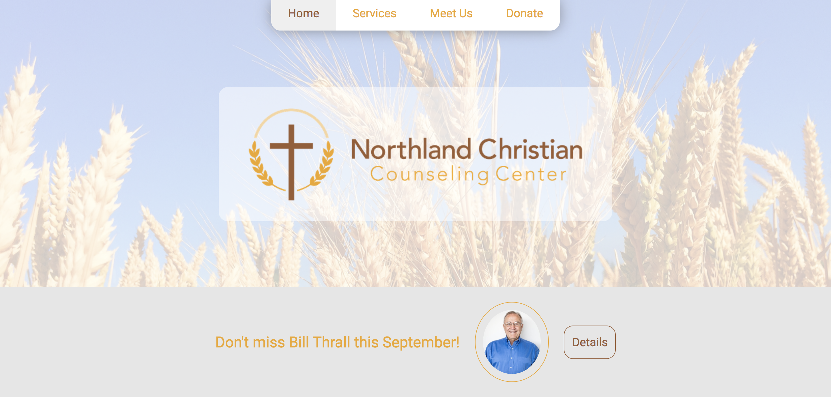
The design includes a splash page that is solely dedicated to a compelling personal story. It immediately pulls the reader in, offers vulnerable human experience, and points to Northland as a place where desperate people can turn when all other options are exhausted. After a larger banner with the Northland logo, and a small section for showing upcoming events, a large title captures the users attention.
A Safe Place to Talk
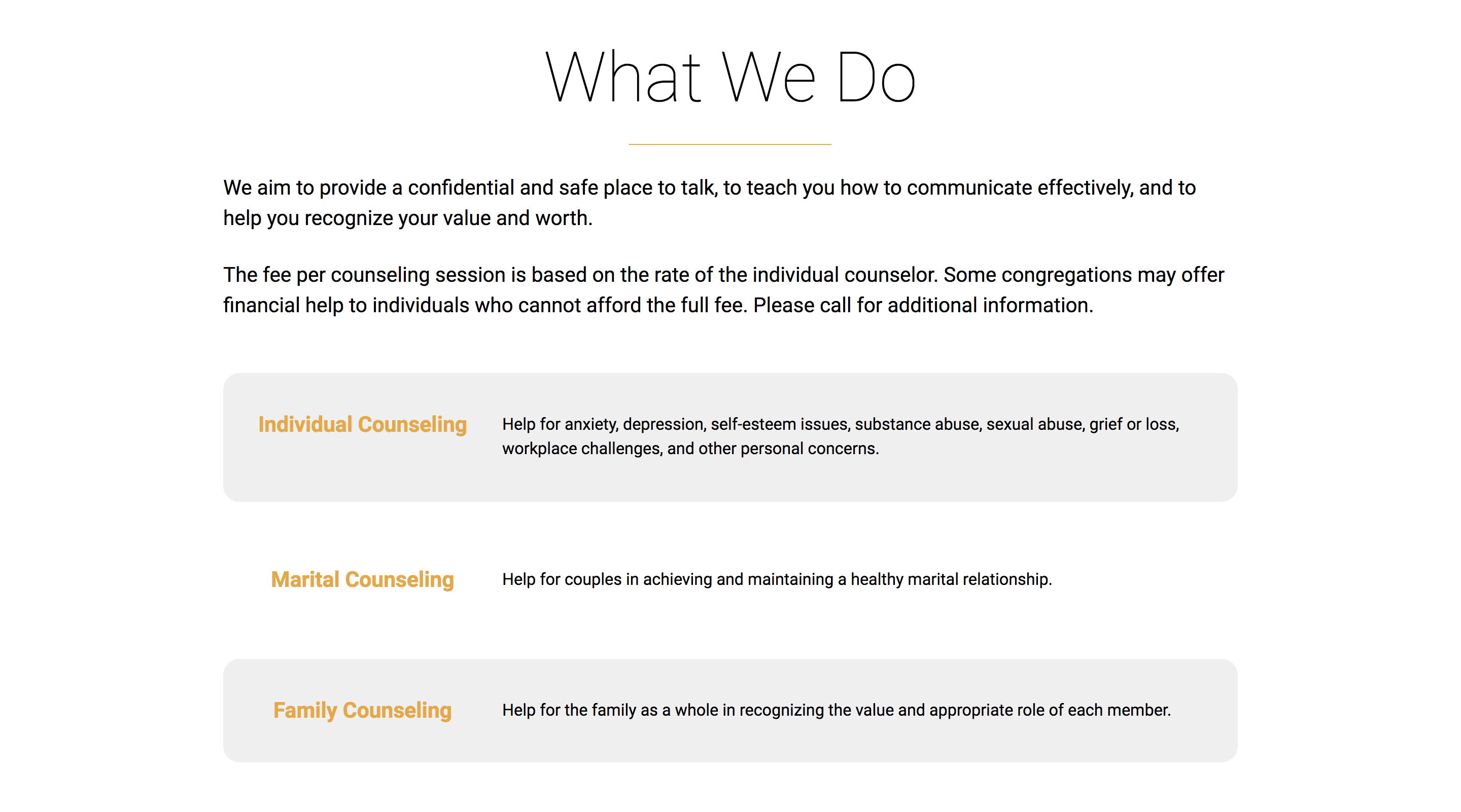
After warmly welcoming a user in the front door, they will quickly want to know what services Northland offers. In addition to efficiently listing out service offerings, it was important to impress upon the users the purpose Northland feels called to, and to communicate their caring attitude toward those looking for help.
The Purpose of Northland Christian Counseling Center is to offer a ministry which aids in the development of each individual’s potential: emotionally, physically, socially, intellectually, and spiritually. This endeavor includes counseling and educational services based on the Word of God.
Meet Us
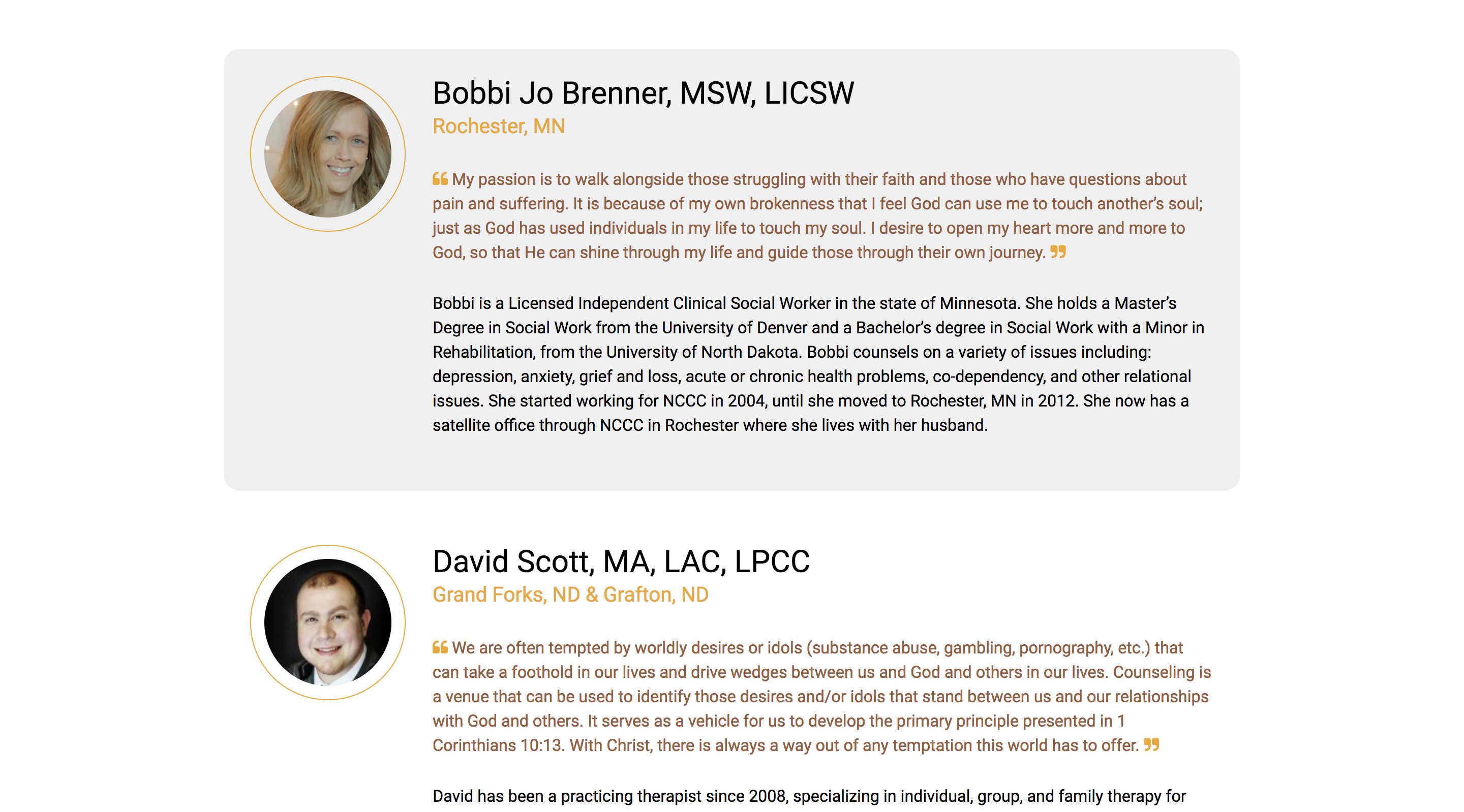
The hands and feet of the counseling center are the counselors, and it was a priority to make the user feel like they were genuinely meeting them in a personal way. Visually separating each counselor’s quote from their biography through the use of color was a helpful step in making this part of the site more digestible.
Partnering with Northland
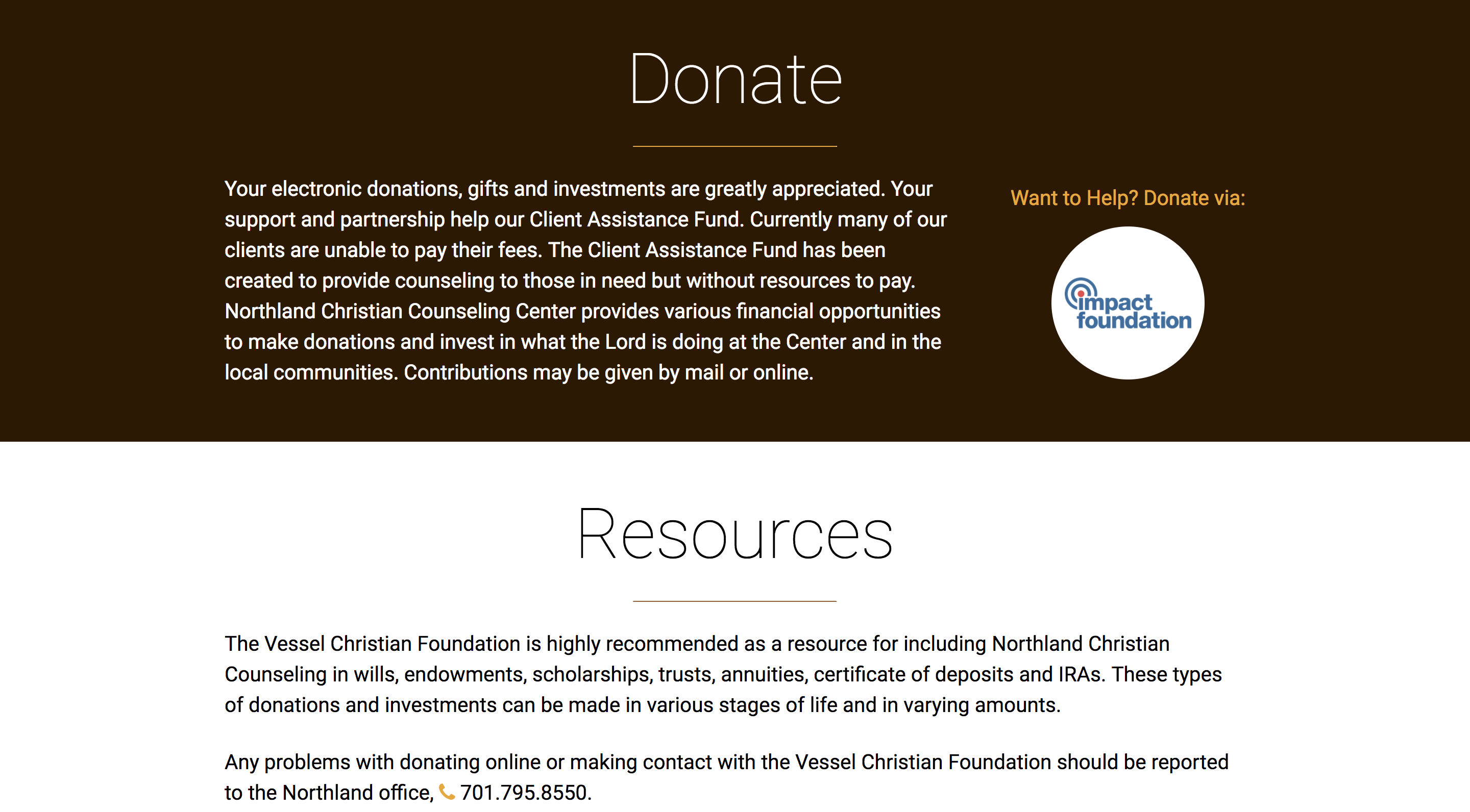
As a non-profit, Northland relies on the generosity of others to continue providing their much-needed services. It was crucial for me to make it easy for users to find ways to help Northland. The donate page has a position in the primary site navigation, which provides valuable resources and explains very clearly how you can help if you are so inclined. I love the fact that one of the most prominent ways they ask for help is through their Client Assistance Fund, which directly aids those who are unable to pay for services.
Final Thoughts
I treasured the opportunity to help such a sincere organization put a fresh coat of paint on their “virtual front door”. Traffic to the site has been promising, and they are adding counselors left and right! They continue to bring compelling speakers to the area, and are generally a wonderful presence in the community.
Previous Case StudyHad the chance to rebuild @Northland_CCC's website! Really happy with the way it turned out! https://t.co/dVmRw9mxAB
— Rand Seay (@randseay) October 9, 2017
